Choosing Interior Colors From the Sherwin-Williams Palette Without Regretting It
Color looks different in every house. Here's how to narrow down a palette you'll actually be happy with long after the crew has left.
September 23, 2026 · 4 min read
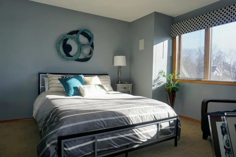
Picking a paint color sounds simple until you're standing in the paint aisle staring at forty shades of gray that all somehow look identical under fluorescent lighting. It's one of the most common places homeowners get stuck before a painting project, and it's worth slowing down on, because the color you choose is the one thing you'll look at every single day once the job is finished. We supply all Sherwin-Williams paints and ask customers to choose from their palette, which is a huge selection, so the real challenge usually isn't a lack of options. It's narrowing a huge selection down to the right one for your specific room.
Test in your own light, not the store's
The single biggest mistake people make with paint color is trusting how a chip looks under store lighting or on a phone screen. Natural light, north-facing windows, warm bulbs, and cool LED fixtures will all shift the same color noticeably, sometimes enough to make a shade you loved in the showroom feel completely wrong on your own living room wall. Before committing to a full room, get a sample onto an actual section of that wall and look at it at different times of day, in the morning, at midday, and again once the lamps are on at night. A color that reads warm and cozy in the evening might feel flat and gray at nine in the morning, and it's much easier to notice that on a two-foot swatch than after four walls are already finished.
Think about the room as a whole, not just the wall
Wall color doesn't exist in isolation. It sits next to your flooring, your trim, your furniture, and whatever is visible through doorways into adjoining rooms. A shade that looks great as a standalone swatch can clash with warm wood floors or fight with a piece of furniture you're not planning to replace. It helps to physically hold a sample next to your flooring, your cabinets if the room has them, and any large furniture staying put, rather than judging the color purely on its own merits. This is also where trim finish matters. A crisp white trim reads very differently against a warm neutral than it does against a cool one, so it's worth looking at the pairing together rather than picking each in isolation.
Getting help when you're stuck
Not every homeowner wants to make this decision alone, and that's completely normal. Customers regularly mention getting hands-on color help as part of working with us. One recent review described how Joe came out twice to talk through options and colors, offered suggestions based on the homeowner's existing decor, and that the eye for color made a real difference in the final result. Another review mentioned the same kind of guidance, helping figure out what colors would actually work with a specific room rather than just picking from a fan deck. If you're torn between a few options, it's worth asking about this kind of input rather than guessing on your own.
- Sample colors directly on your own wall, not just on a paint chip
- Check the sample in morning light, midday light, and evening lamp light
- Compare the color against your flooring, trim, and any furniture staying in the room
- Look at how the shade reads next to adjoining rooms visible through open doorways
- Ask for color guidance if you're stuck between a few finalists
Small rooms and large rooms behave differently
Scale changes how a color reads, too. A shade that feels soft and muted on a small sample can turn bold and saturated once it covers four full walls in a large open room, simply because there's so much more of it reflecting light back at you. The reverse happens in small spaces, where a deep or dramatic color that looked striking on a swatch can feel closed in once it wraps an entire small bathroom or hallway. If you're on the fence between two shades of the same color family, it's often worth leaning toward the lighter or more neutral option for a large room and reserving bolder choices for smaller spaces, accent walls, or rooms you spend less time in.
Finish and sheen matter as much as the color itself
It's easy to focus entirely on the color name and forget that sheen changes how that same color looks and performs. A flat or matte finish tends to hide small wall imperfections but shows fingerprints and scuffs more easily, while a satin or eggshell finish holds up better to cleaning and everyday wear in high-traffic rooms like hallways, kids' rooms, or kitchens. Trim and doors are usually painted in a different sheen than the walls around them for exactly this reason. None of this needs to be figured out alone. Since we supply all Sherwin-Williams paints for the job, ask us about sheen when you pick your colors and we will help you sort it out.
There's no rush to decide alone
A color choice doesn't need to be made in a single trip to the paint counter. Taking a sample home, living with it on the wall for a few days, and asking for a second opinion are all normal parts of getting this right. The goal is a finished room you're still happy with a year from now, not just the day the crew packs up.
Ready to talk through colors for your own space? Visit our Interior Painting page, browse more customer experiences on our Reviews page, or call us at (920) 203-8641 to set up a free estimate.
Kenowski Painting Services LLC, (920) 203-8641
Call (920) 203-8641More articles
Getting Your Rooms Ready for an Interior Painting Crew
A little bit of prep on your end makes the whole project go faster, and most of the heavy lifting is on us anyway.
Refinish or Replace? Painting Cabinets and Built-Ins
A fresh finish can transform outdated cabinetry without tearing out anything that's still structurally sound.